


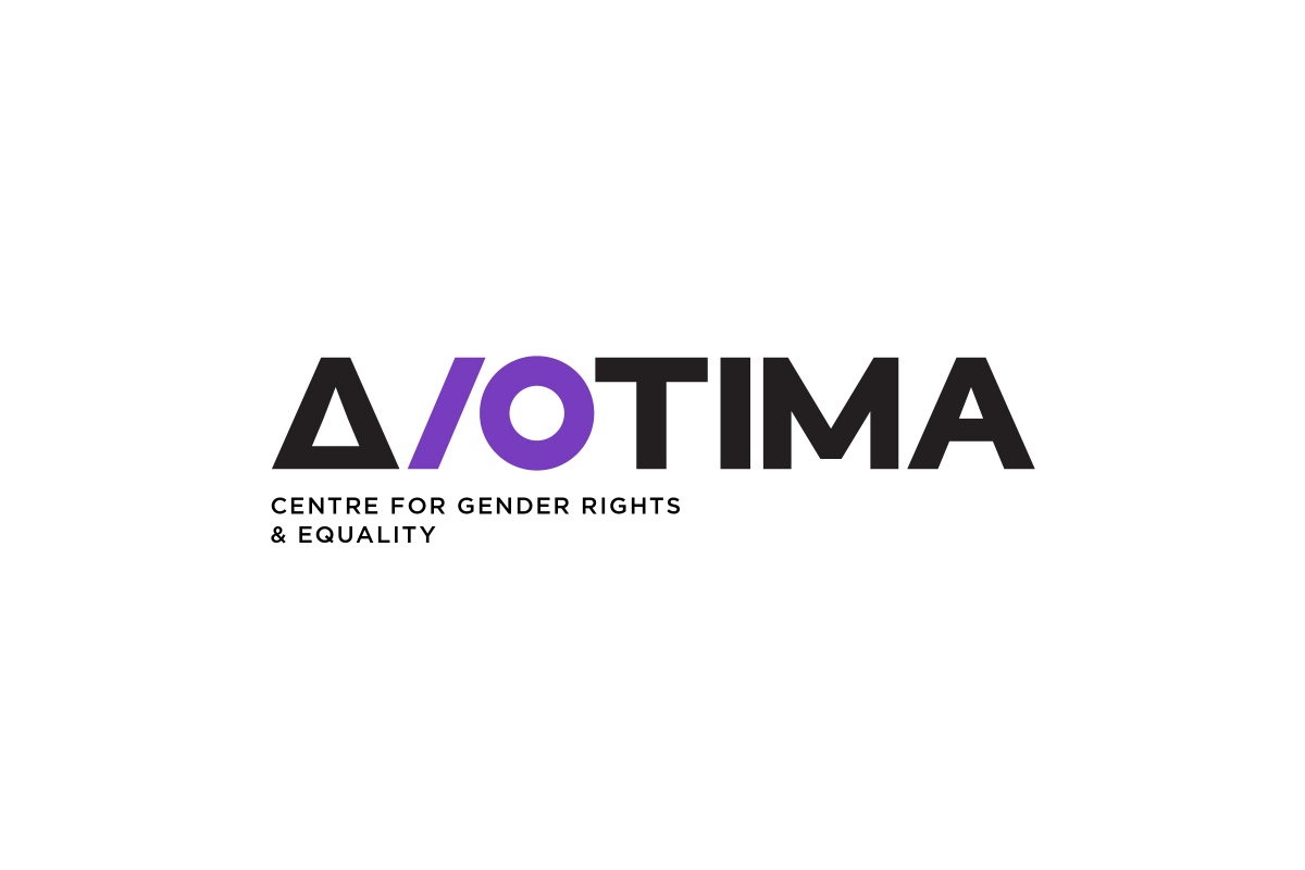
Client: Diotima Centre for Gender Rights and Equality
What We Did: Rebranging & New Visual Language, Print and Digital Brand Applications
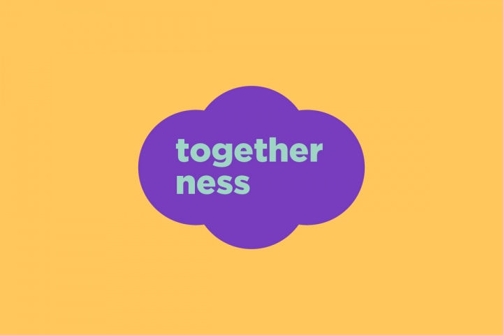
Gazing at the future, at the challenges and perspectives of a world without gender-based violence and discriminations, we focused on a minimal and symbolic approach that could encompass the different aspects and directions that the centre specializes in.
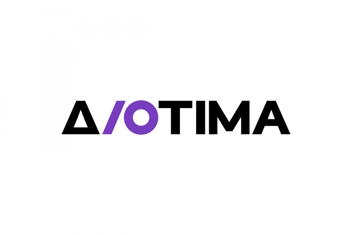
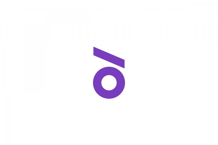
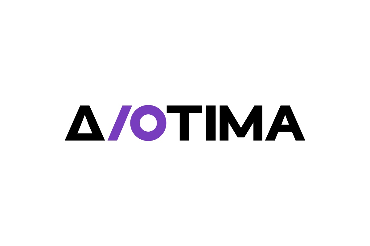
The solid, geometric typography of the logo is 'compromised' by the insertion of a slanted I, which, in combination with the circle of the letter O creates a new symbol for the organization. In its vertical positioning, the symbol forms a lowercase greek δ (delta), the first letter of Diotima.
The symbol's circle signifies the concepts of inclusion, protection, solidarity, teamwork and support. The diagonal line symbolizes dynamism, energy and movement. As a whole, the new symbol, placed inside the logo's typography, symbolizes a change of perspective, as well as the opposition to the existing systems of oppression and inequality. From the dynamic contrast that is thus created, the prestige and stability of the black, geometric letters contrasts in a dialectic way with with the movement, liveliness and energy of the intervening symbol.