
Client: Athens Biennale
What we did: Logo, poster, flag design
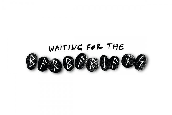
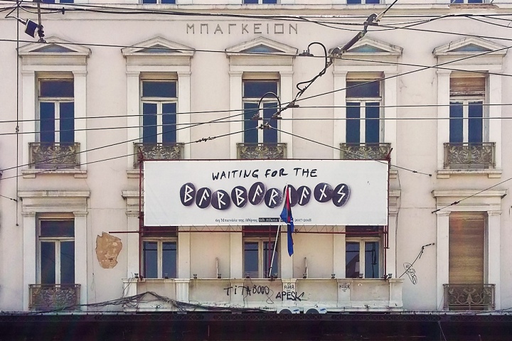
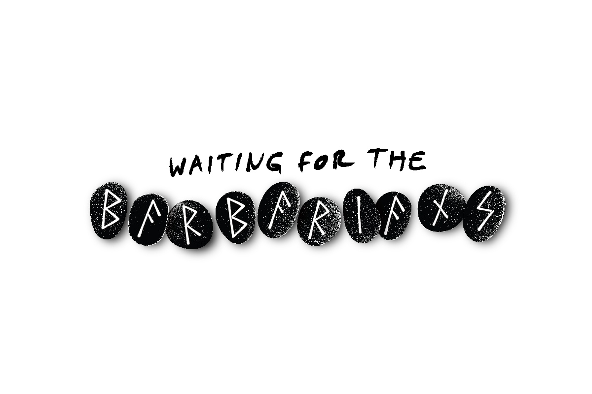
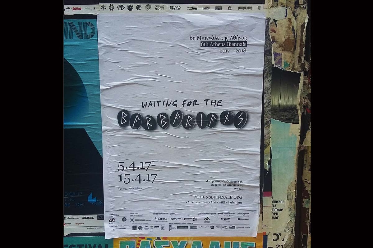
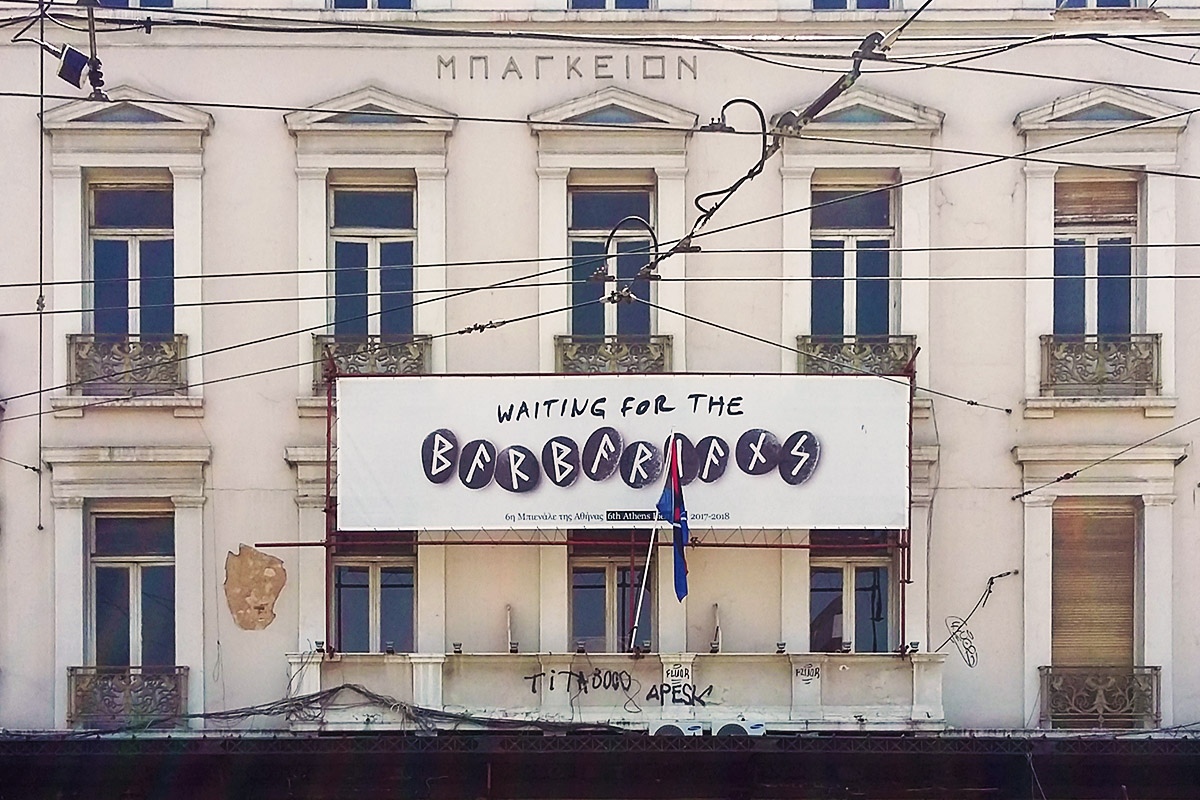
The visual communication design of Waiting for the Barbarians was divided into two optical directions: The title logo and the flag / emblem of the Heart & Sword Division. For the design of the title we drew inspiration from the rune alphabet, which was used by Teutons and Vikings before they started using the western alphabet. The meaning of the symbols was only revealed to druids and their apprentices, so the Runic symbols / letters have a mystical aura that fits with the philosophy of the exhibition. At the same time, they pose a reference to the “Barbarians” of the title. Marked on round black stones, they further amplify our message.
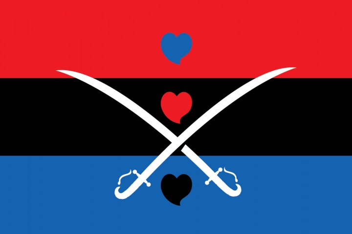
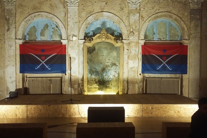
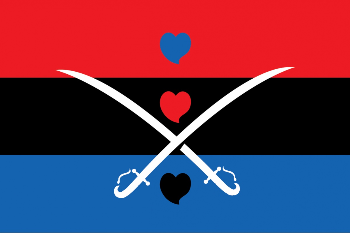
The flag / emblem on the other hand has its roots in a domestic story. It is a re-approaching of the revolutionary emblem of the legendary Lambros Katsonis. Here, the radical nature of the team is highlighted, as they aim at destroying the stereotyped use of the term “Barbarian”. It also highlights another aspect: Greekness or -more broadly- a return to the roots, which plays an important role in the philosophy of the team.
