









Client: Athens Biennale
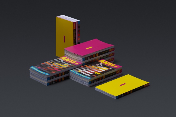
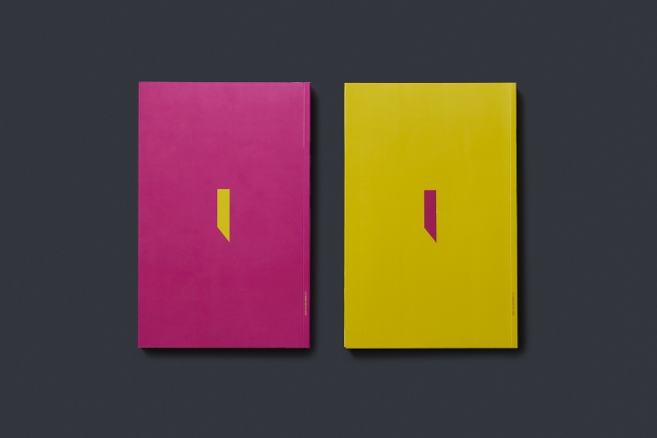
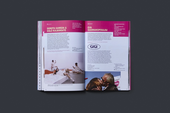
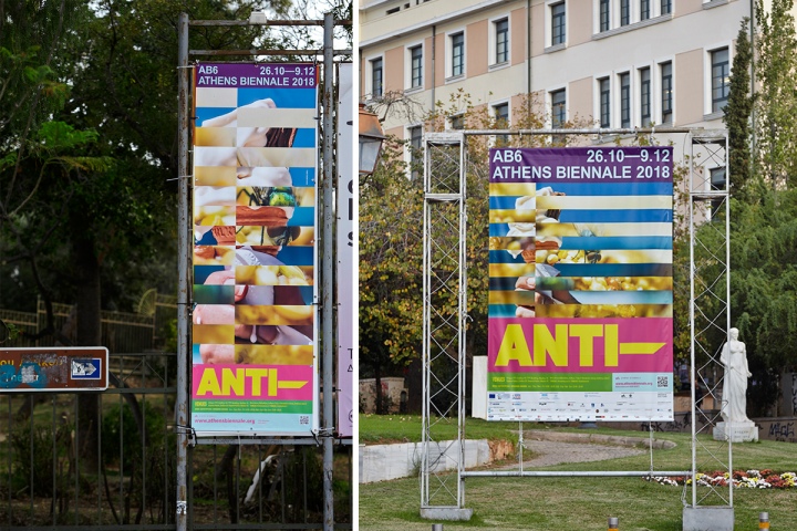
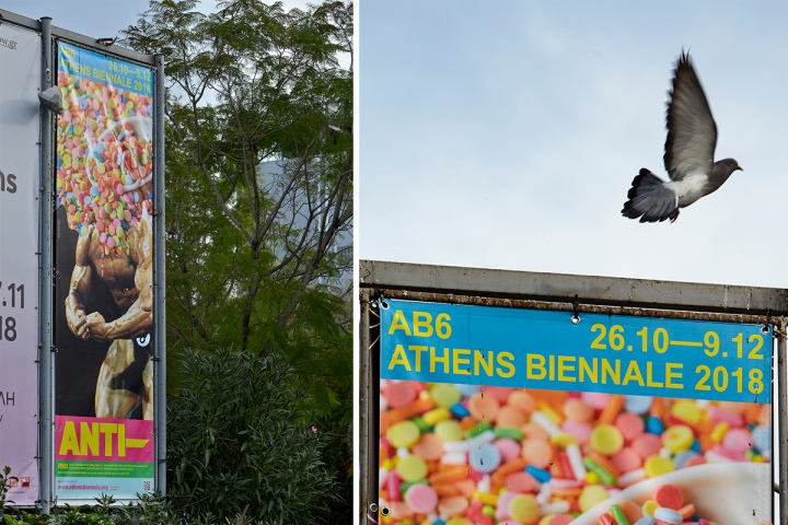
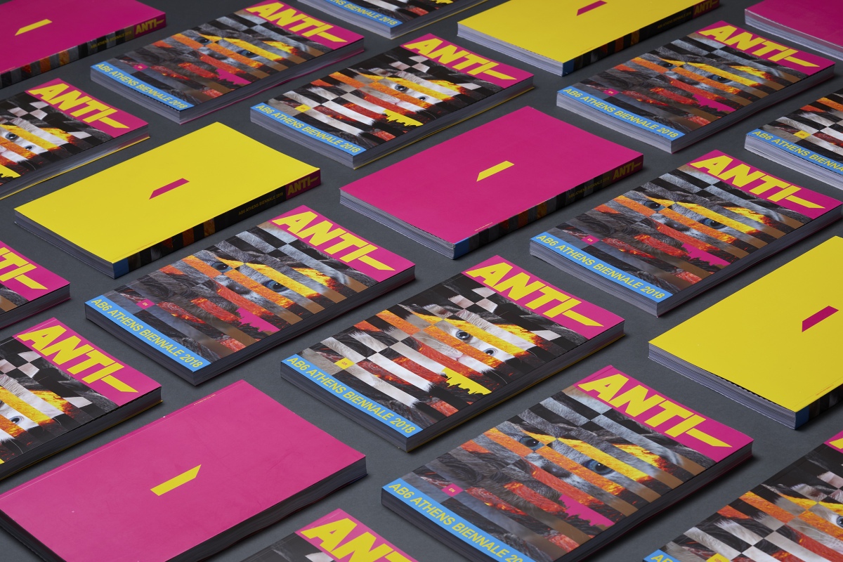
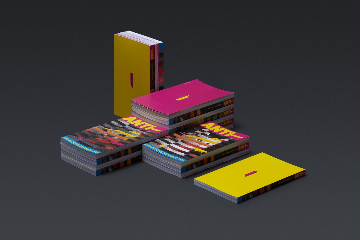
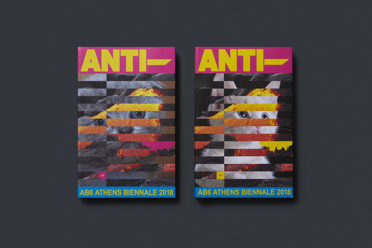
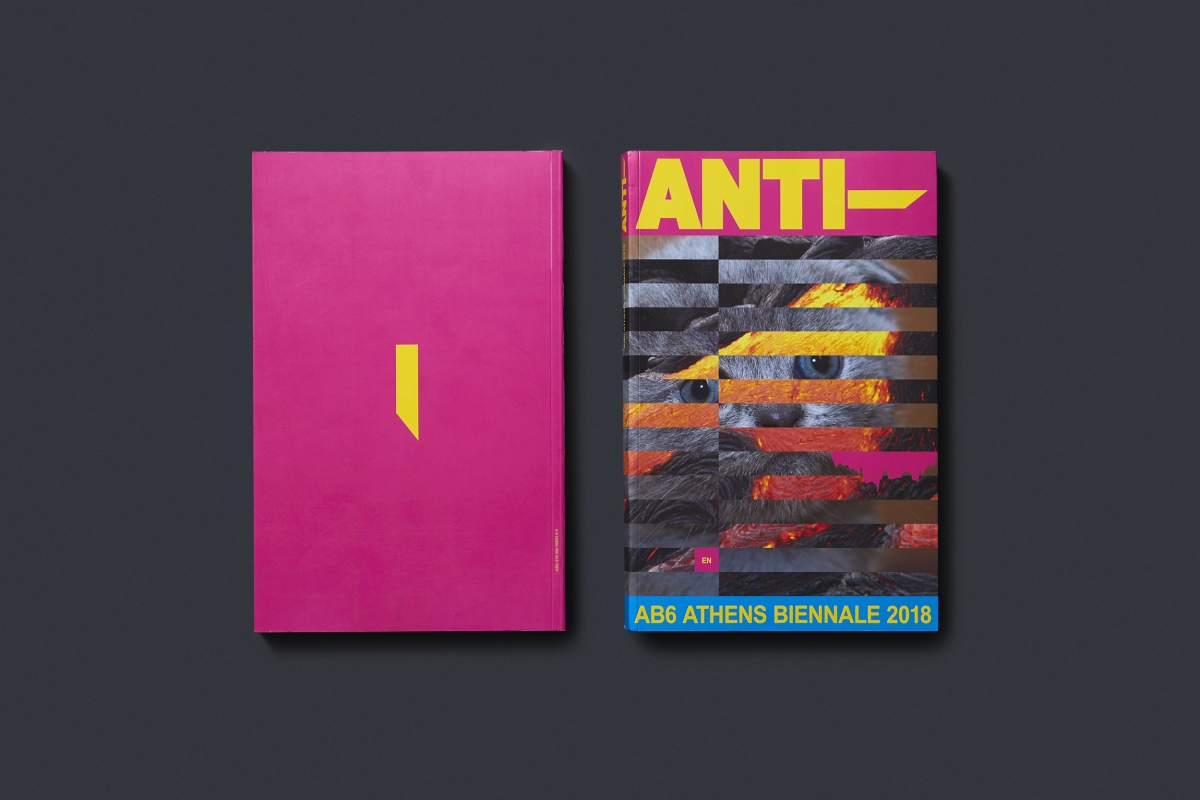
What We Did: Visual Identity, Website design and Digital Applications, Exhibition Catalogue, Poster, Banner, Misc Applications
In collaboration with Michael Oswell
Photoshooting: Giorgos Vitsaropoulos and Giannis Zindrilis
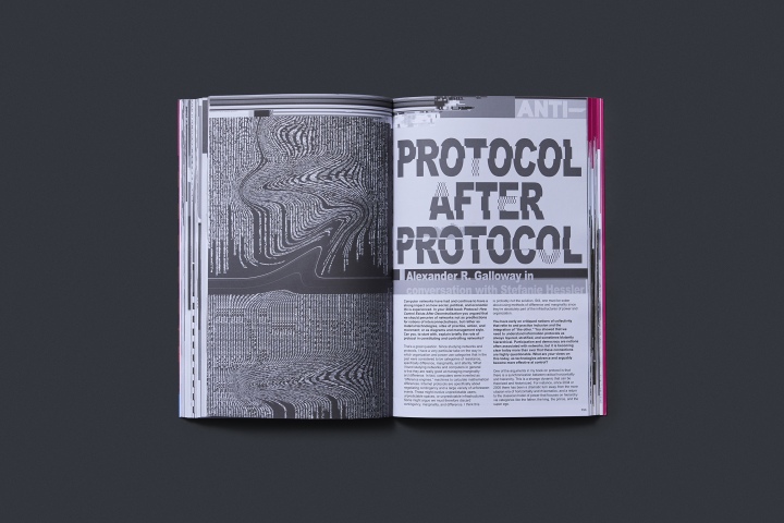
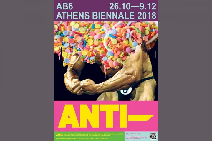
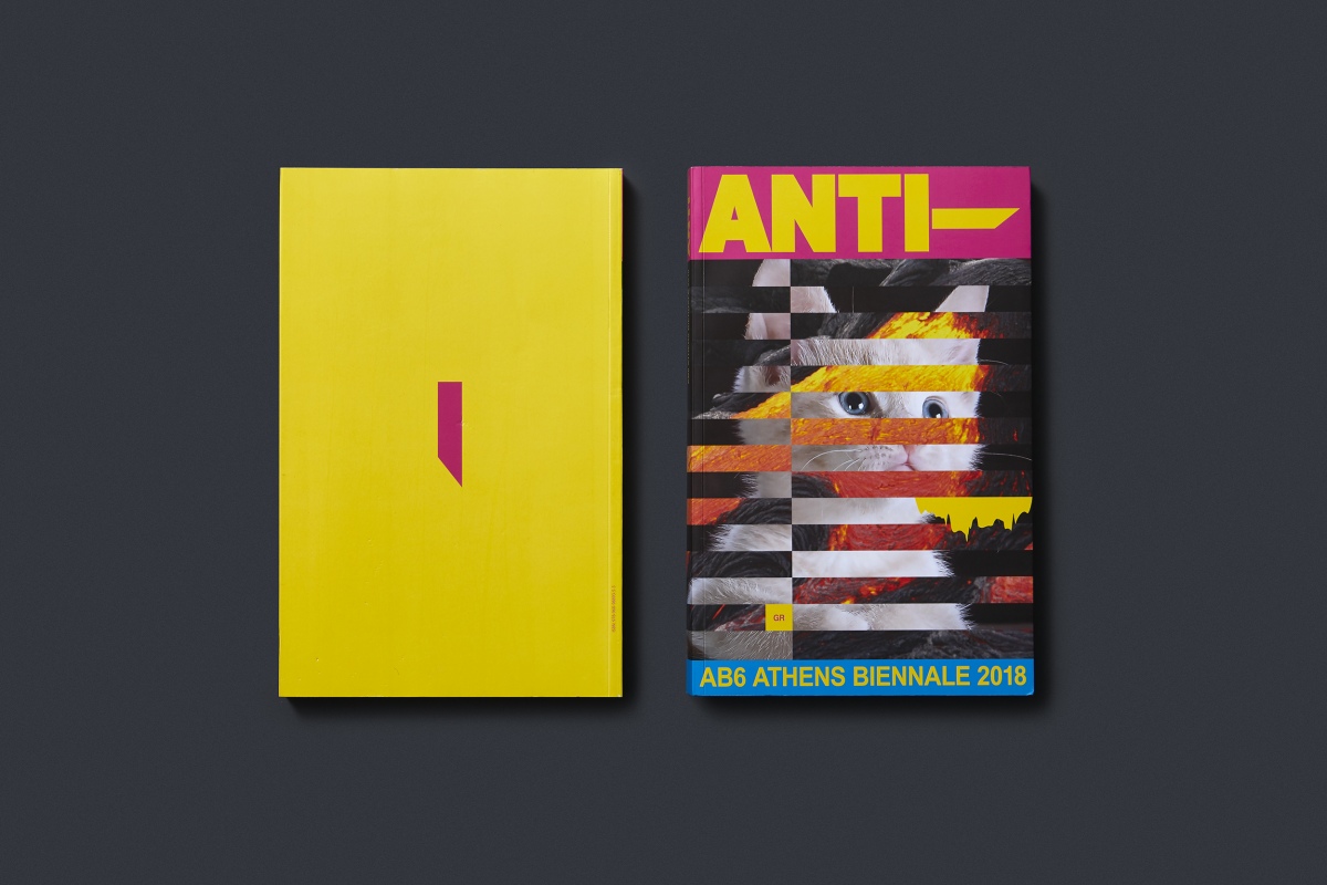
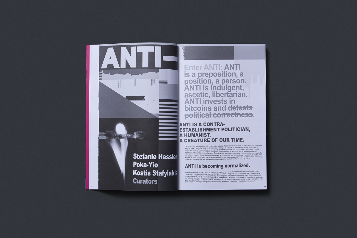
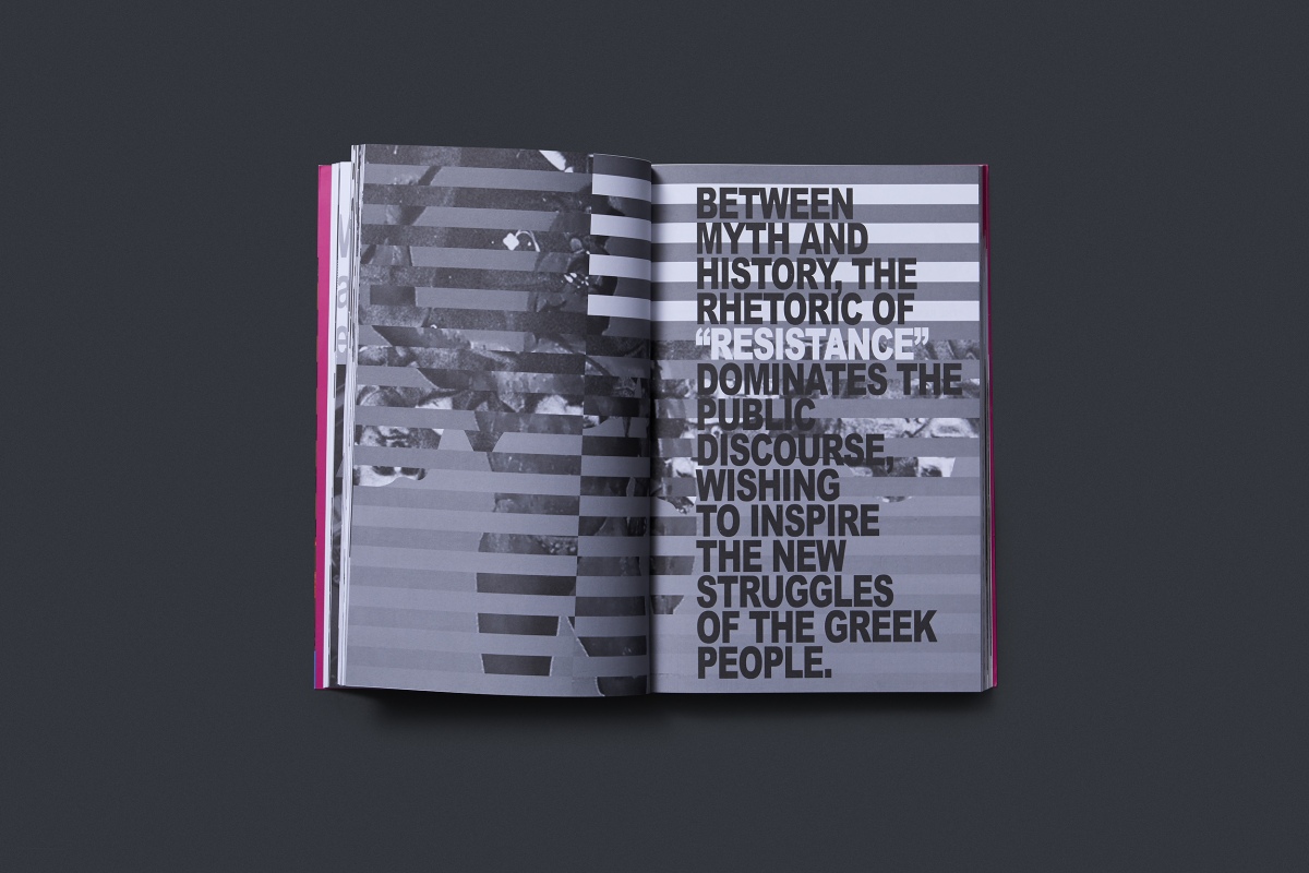
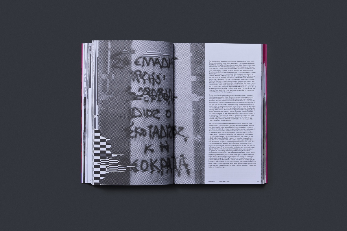
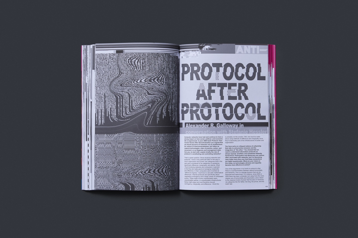
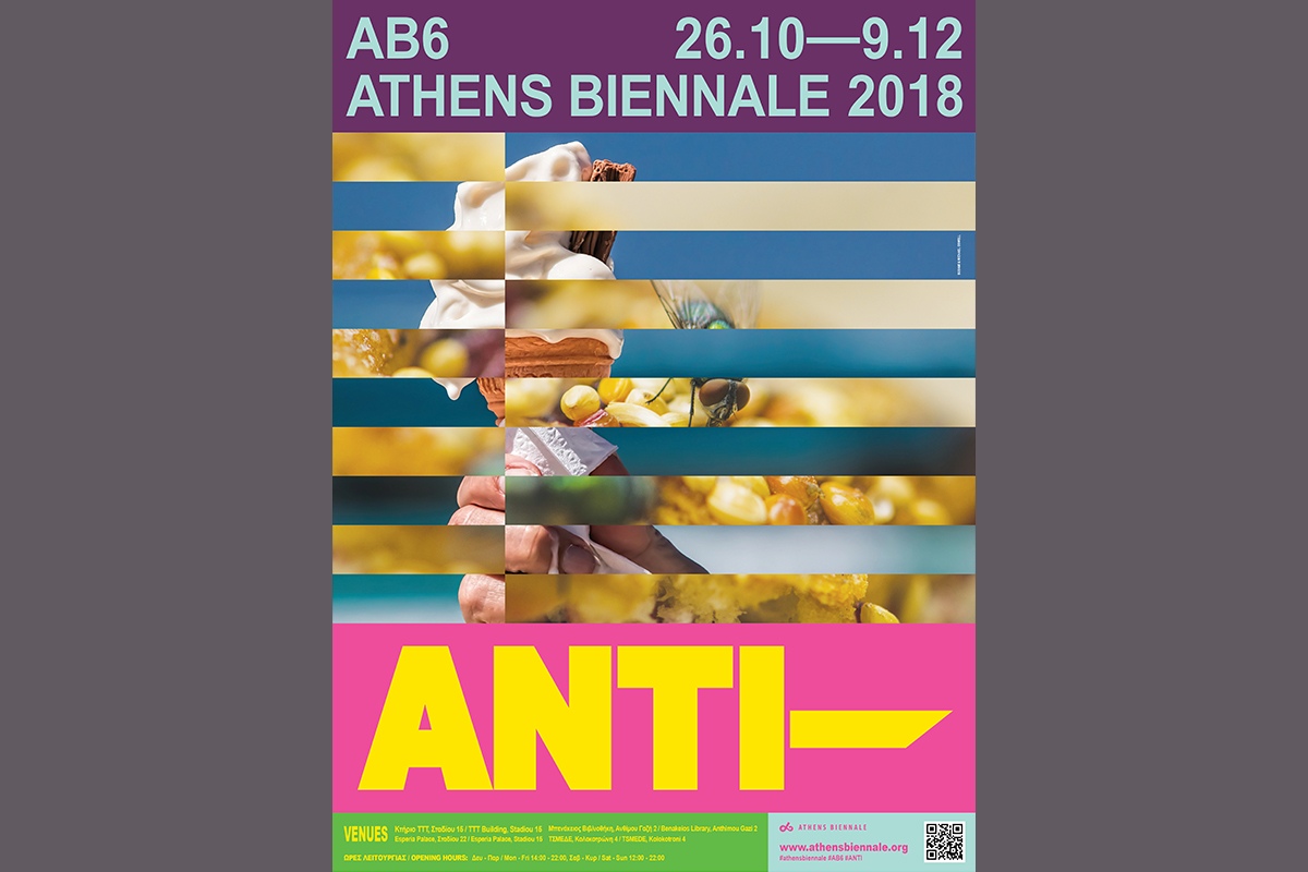
ANTI (Greek for “Counter-” = opposition) presupposes the existence of at least two opposing ideas, forces, situations. The conflict between them creates the space for ANTI’s development. Through this conflict a new result with its own dynamics derives, maintaining characteristics drawn from all conflicting forces. This dialectical relationship is the basis of the aesthetics we created for the visual communication of the exhibition and the catalogue.
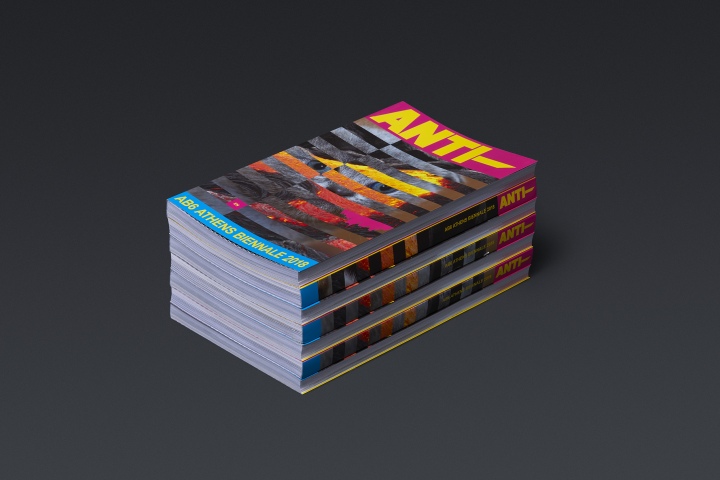
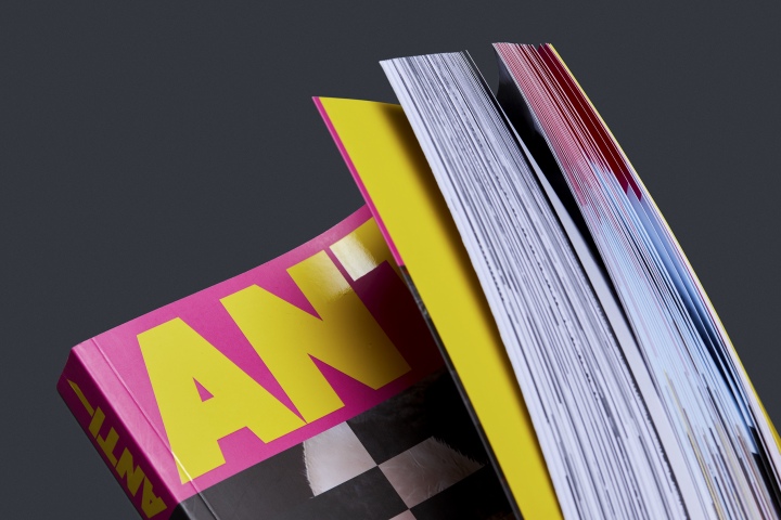
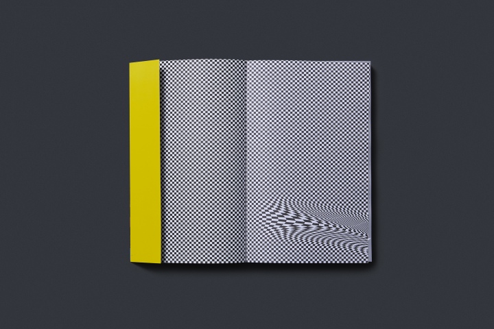
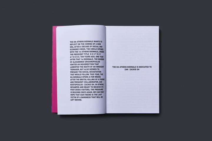
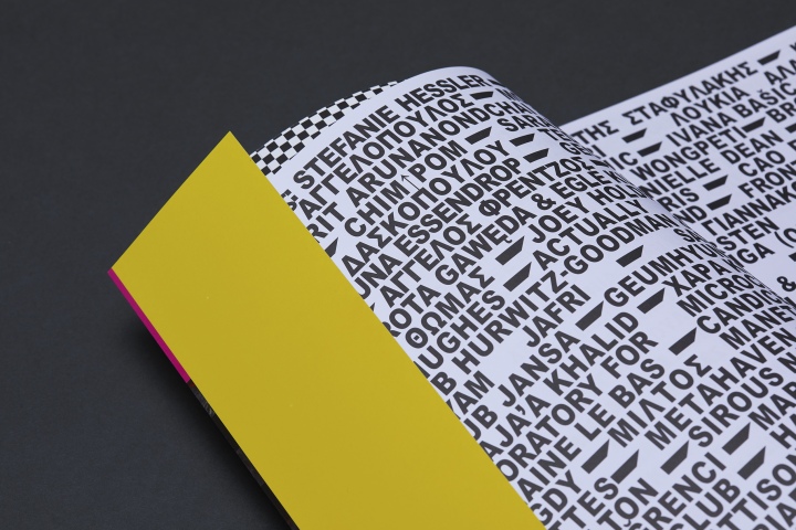
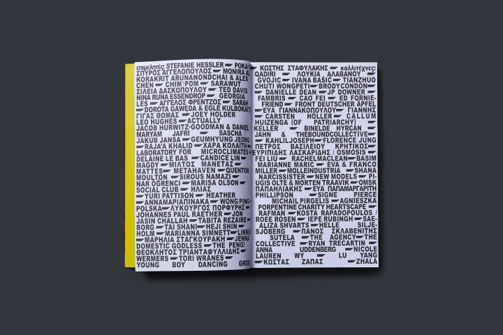
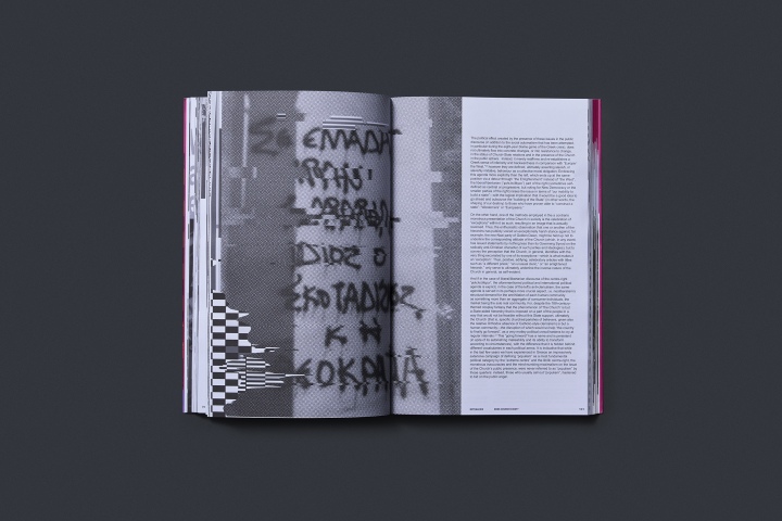
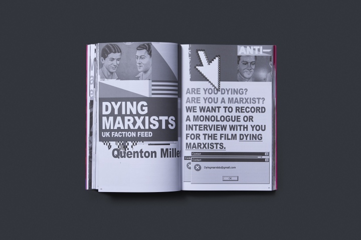
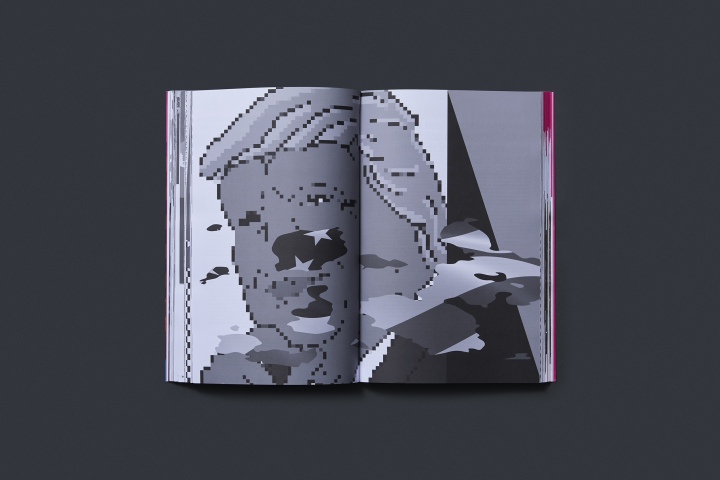
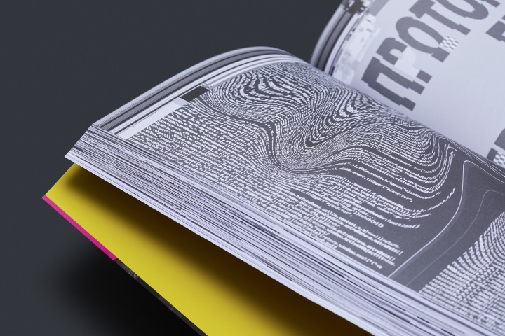
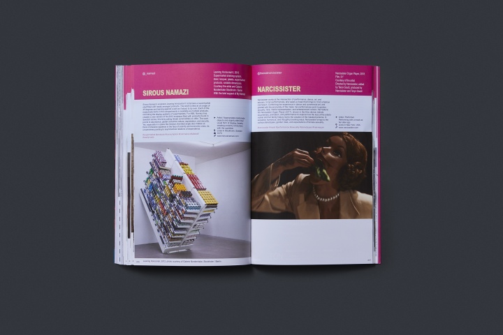
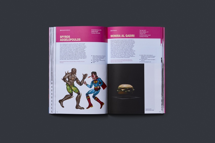
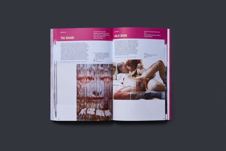
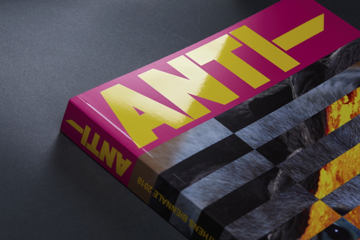
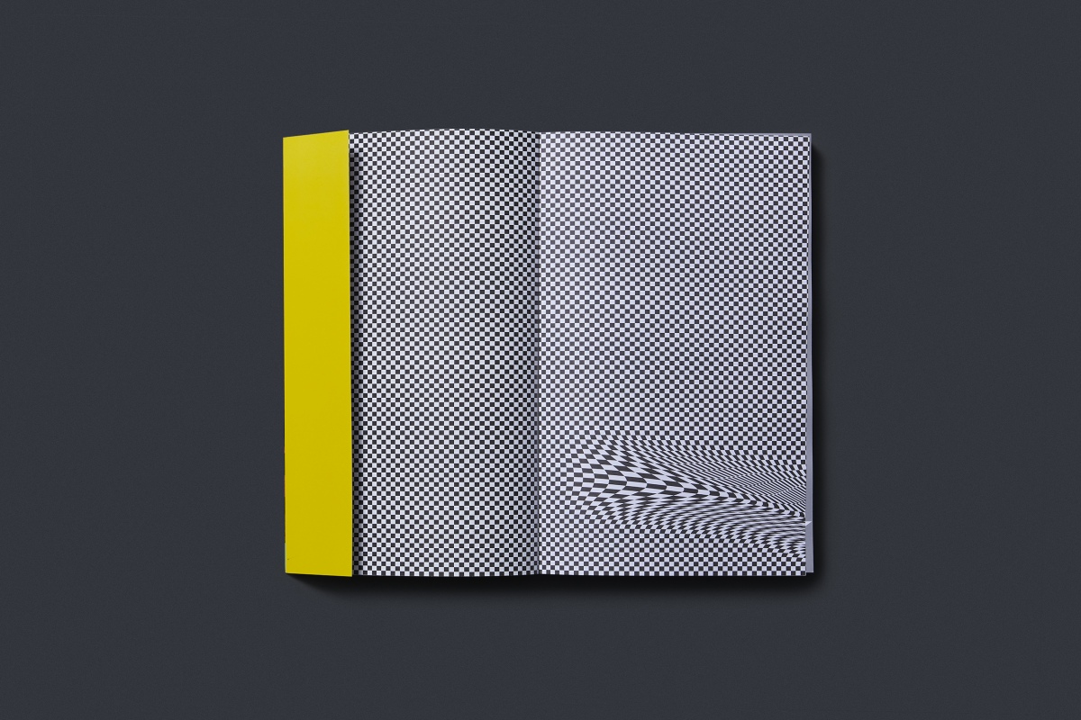
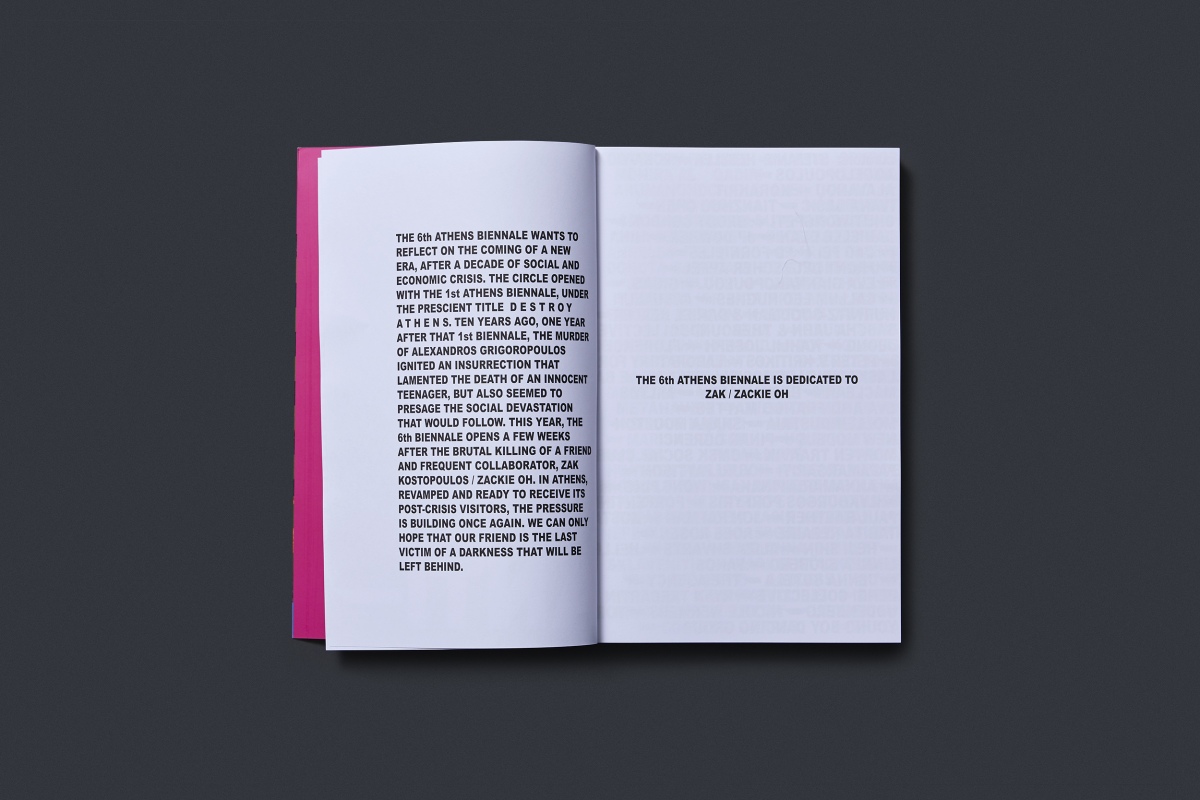
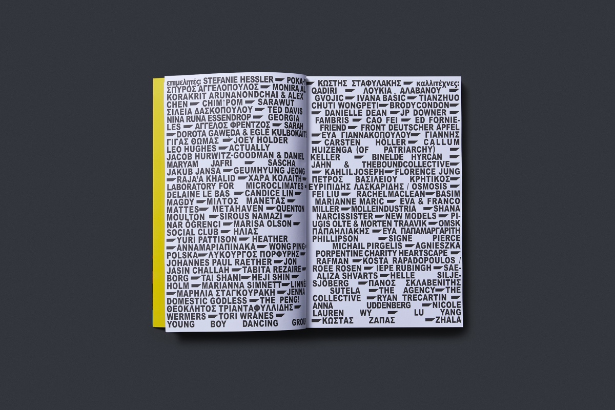
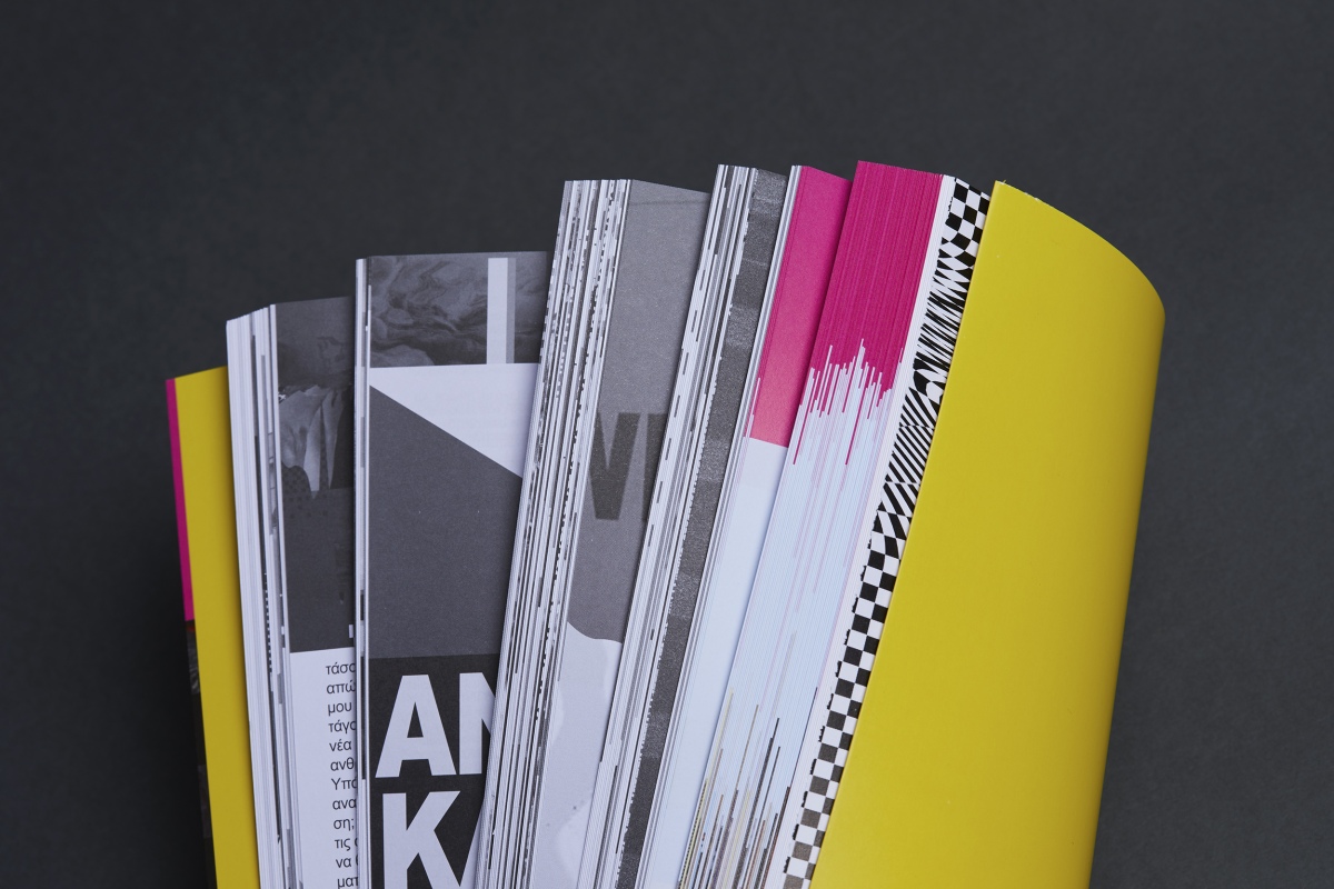
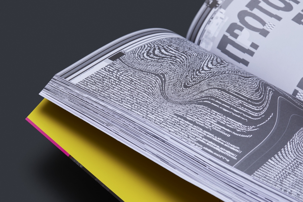
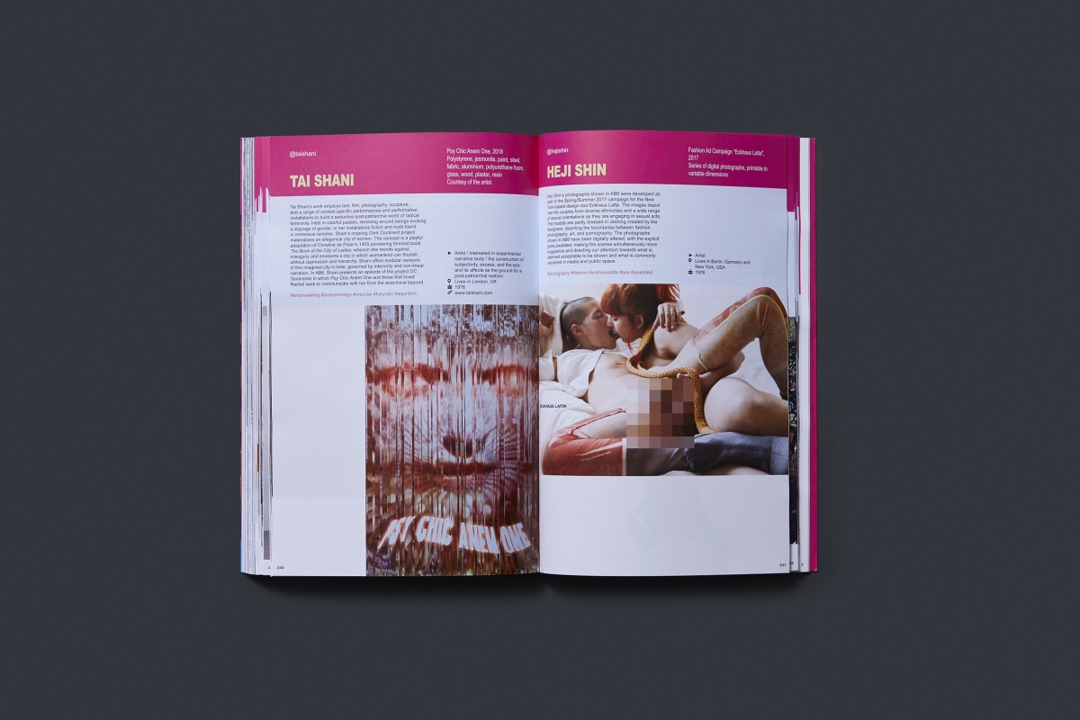
Through a process of creating visuals that derive from the clash between two or more opposing images, a sense of chaos and imbalance is attempted. This is further amplified by the addition of intense diy, glitch, cyber, noisy visual ‘touches’. At the same time, the extensive use of a default font such as Arial, brutalistically stretched according to the needs of each page, as well as the use of common stock images and photographs from local news, serve as a comment on the vanity of the digital world, and mainly of social networks.
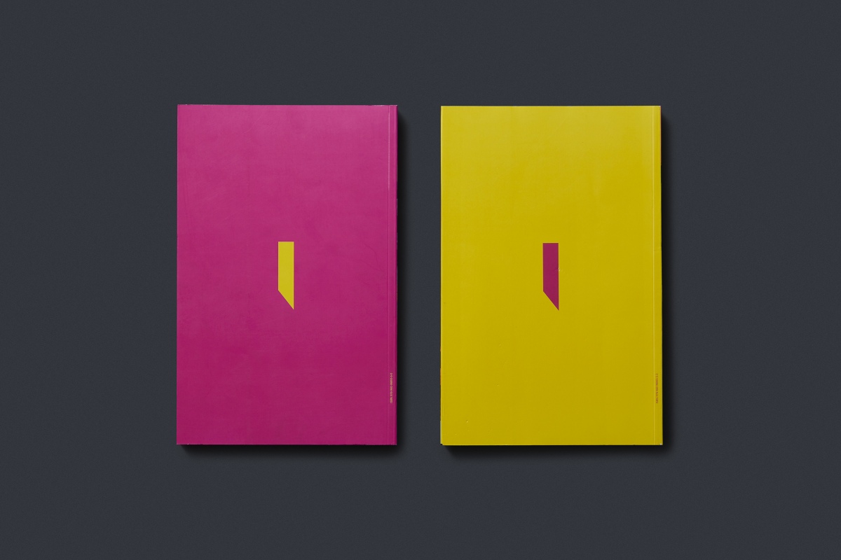
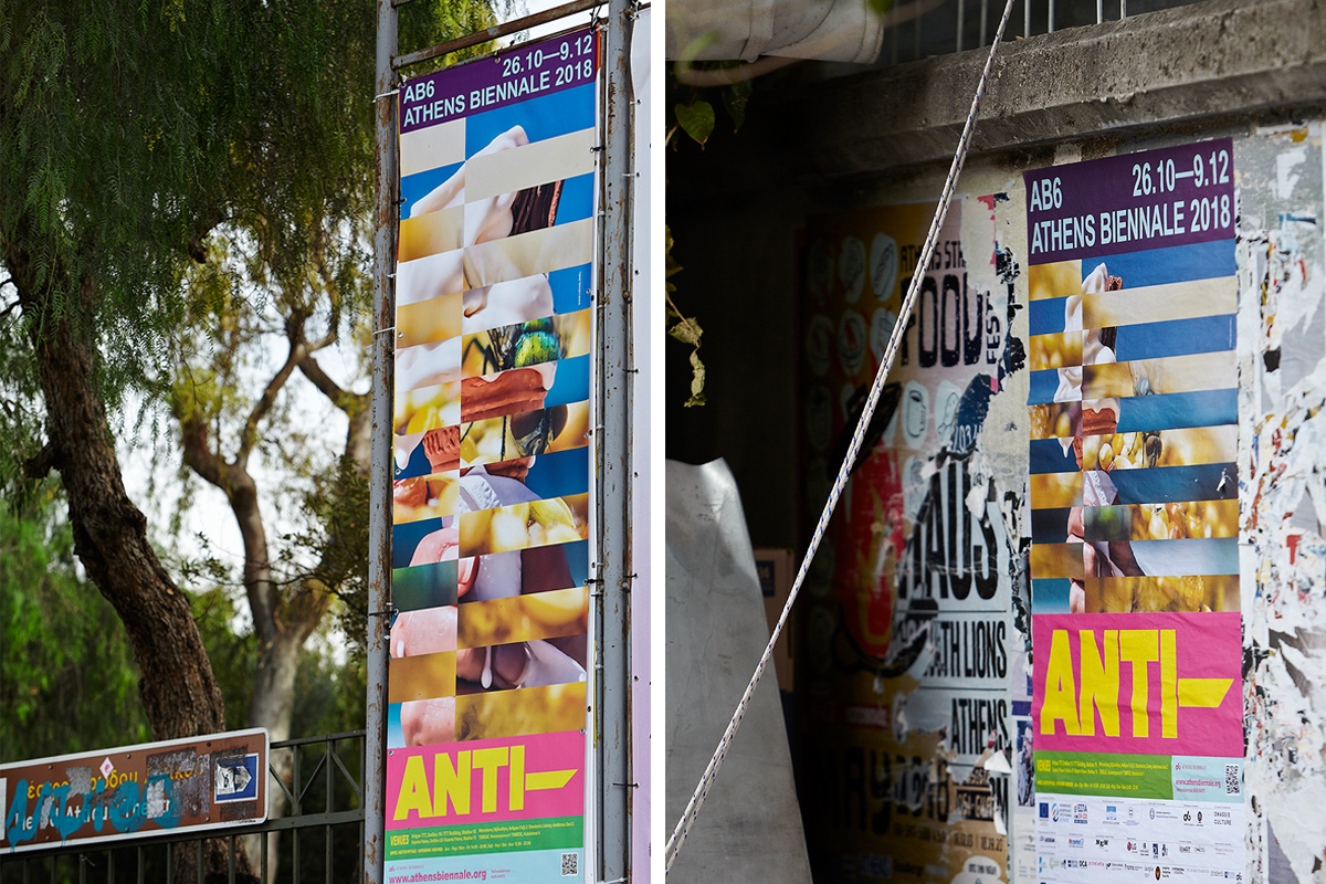
The above characterstics exist in all visual communication material, and are especially obvious in the catalogue, the outdoors communication and the website and digital applications.
Check Also: https://anti.athensbiennale.org/

