
Client: Aestheses Food & Wine perception
What we did: Logo and stationery design
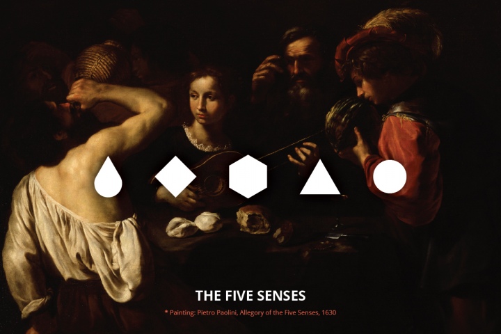
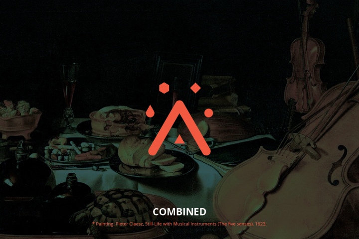
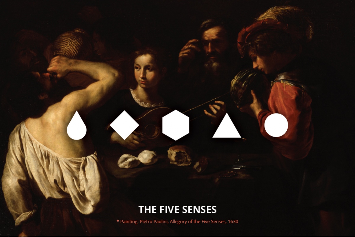
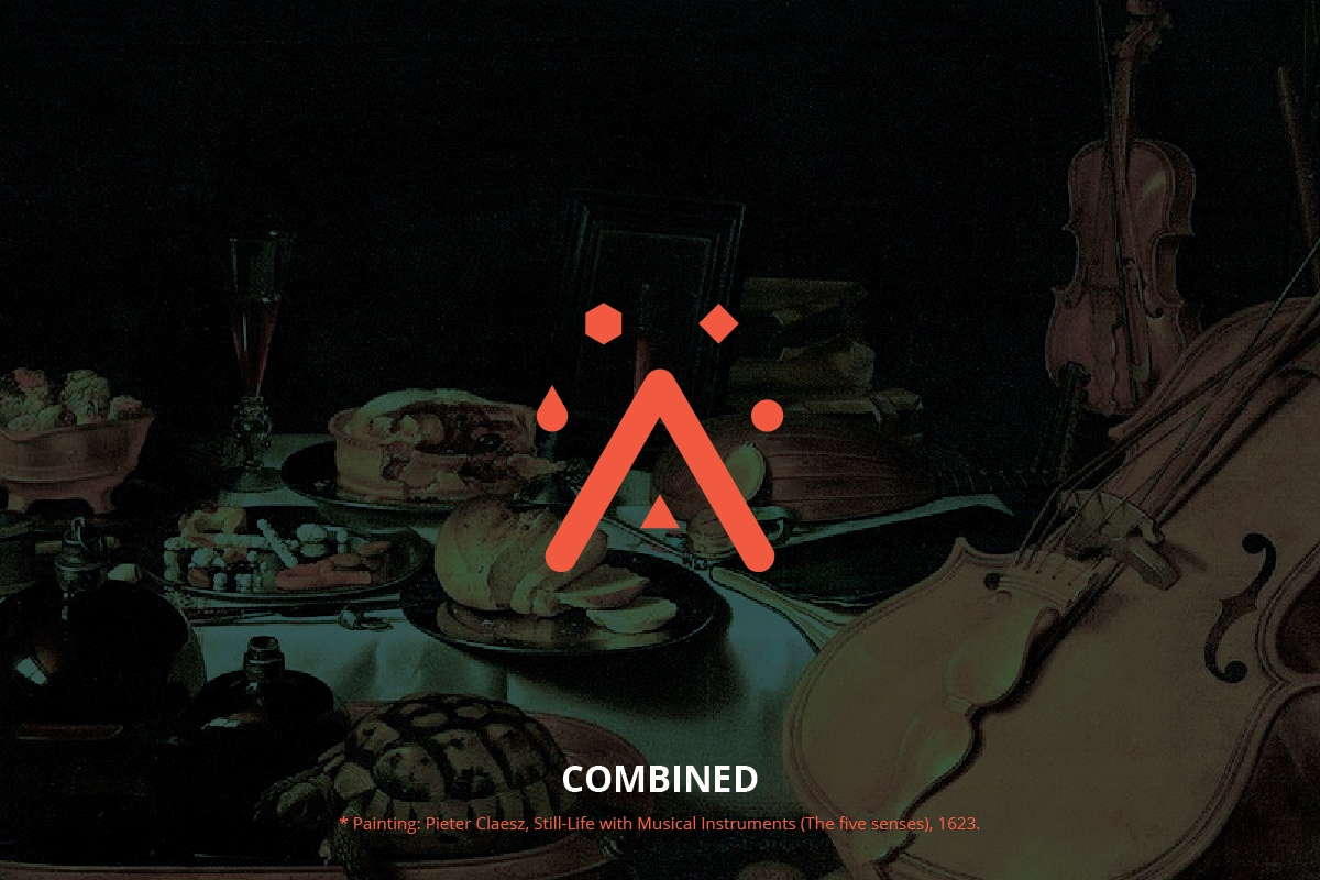
The word Aestheses derives from ancient greek and literally means 'senses'. We decided to design the company logo in an abstract, symbolic way. The five senses are depicted as basic shapes (triangle, square, circle and rhombus), as well as a drop, that symbolizes wine, olive oil, water etc. The symbols surround the letter A, first letter of the word aestheses.
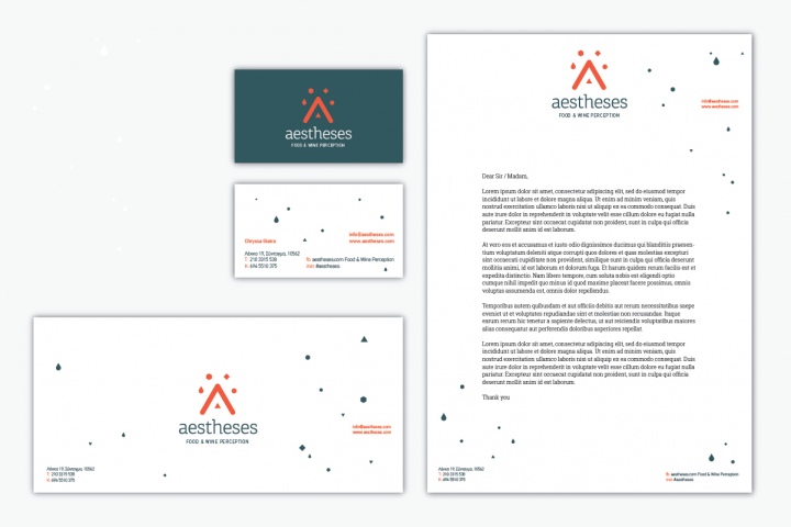
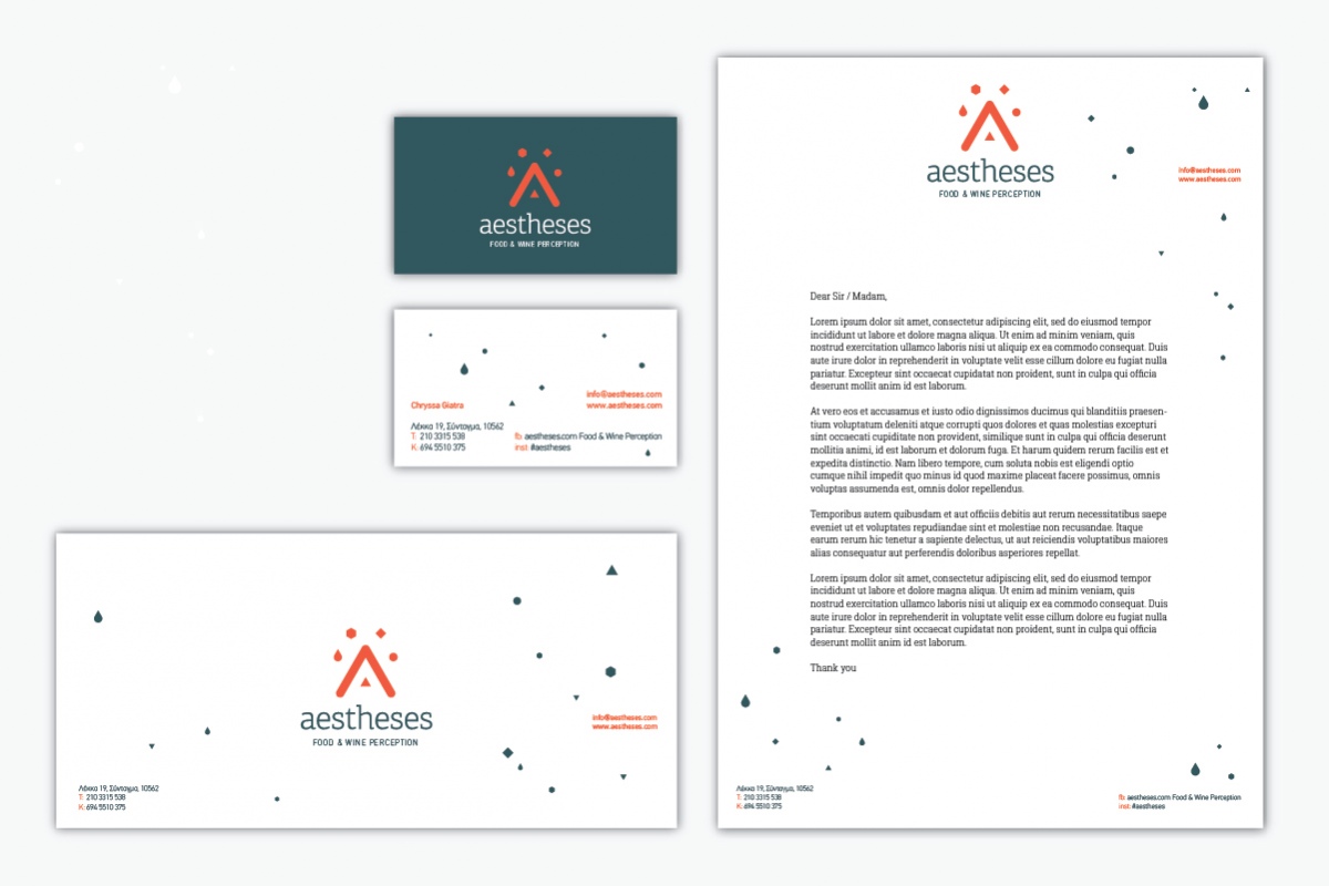
The five symbols play a major role in the design of the stationery material also, creating 'fluid' patterns that resemble wine sparkles and even falling spices or salt.
